
Your marketing dashboard is only as powerful as the metrics you choose to put on it. The right marketing dashboard metrics give leadership a clear, confident read on performance. The wrong ones create noise, confusion, and decisions based on vanity numbers that look good but change nothing.
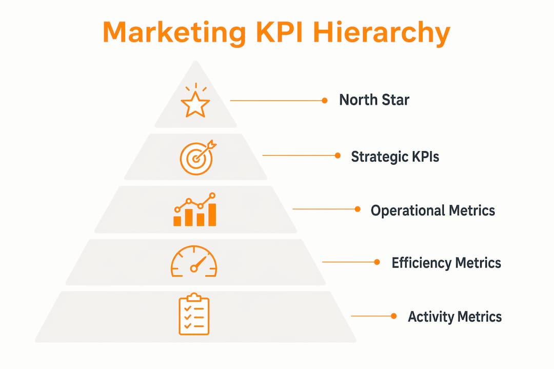
Best practice calls for limiting dashboards to a moderate number of core metrics aligned directly with business objectives. That range isn’t arbitrary. It reflects how much information the human brain can meaningfully process at once before signal becomes static.
Table of Contents
- What marketing dashboard metrics should you prioritize?
- Core categories of marketing KPIs with practical examples
- How to design and interpret dashboards that actually work
- How Theartistevolution applies these principles to generate client results
- Common pitfalls that undermine dashboard metrics
- Key Takeaways
- Why storytelling is the metric your dashboard is missing
- Theartistevolution builds dashboards that connect metrics to outcomes
What marketing dashboard metrics should you prioritize?
The most effective dashboards are built around one north star metric that reflects your primary business goal, supported by headline KPIs across four core functions:
- Revenue: Marketing ROI, Customer Lifetime Value (CLV), Return on Ad Spend (ROAS)
- Acquisition: Customer Acquisition Cost (CAC), Marketing Qualified Leads (MQLs), Cost Per Lead (CPL)
- Engagement: Click-Through Rate (CTR), Email Open Rate, Social Media Engagement Rate
- Efficiency: Conversion Rate, Cost Per Acquisition (CPA), Pipeline Contribution
Every metric on your dashboard should answer a specific business question. If you cannot name the decision a metric informs, it does not belong there.
Raw numbers alone tell you very little. Effective dashboards pair every figure with context: a target, a prior-period comparison, or an industry benchmark. A 3% conversion rate means something very different depending on whether your goal was 5% or 1.5%.
Pro Tip: Pick one north star metric that reflects your company’s primary growth driver, such as pipeline contribution for a B2B company or ROAS for an e-commerce brand. Build every other dashboard metric in service of that single number.
Core categories of marketing KPIs with practical examples
Marketing dashboards serve multiple roles across an organization, so the metrics that matter most depend on who is reading them and what decisions they need to make.

Acquisition metrics
These track how efficiently you bring new customers into the funnel.
- CAC (Customer Acquisition Cost): Total marketing and sales spend divided by new customers acquired. For SaaS, healthy CAC benchmarks typically pair with an LTV:CAC ratio of 3–5x.
- MQLs: Leads that meet predefined quality criteria, signaling readiness for sales engagement.
- CPL (Cost Per Lead): Spend required to generate each lead, useful for comparing channel efficiency.
Revenue metrics
Leadership cares most about these. They connect marketing activity directly to the bottom line.
- Marketing ROI: Revenue attributed to marketing divided by marketing spend.
- ROAS: Revenue generated per dollar spent on paid advertising, the primary KPI for paid media performance.
- CLV: Projected total revenue from a customer over their full relationship with the brand.
- Pipeline Contribution: The share of the sales pipeline sourced directly from marketing efforts.
Engagement metrics
These reveal how audiences interact with your content and campaigns.
- CTR: The percentage of people who click after seeing an ad or email, a direct signal of message relevance.
- Email Open Rate: Measures subject line effectiveness and list health.
- Social Media Engagement Rate: Interactions relative to audience size, more meaningful than raw follower counts.
Efficiency metrics
Efficiency metrics tell you whether your marketing machine is running well or burning budget.
- Conversion Rate: The percentage of visitors completing a desired action, from form fills to purchases.
- Bounce Rate: High bounce rates on key landing pages often signal a mismatch between ad messaging and page content.
- Lead-to-Customer Conversion Rate: How well marketing-sourced leads actually close, connecting marketing quality to sales outcomes.
CMOs focus on strategic KPIs like pipeline contribution, CAC, and ROI. Channel managers track operational metrics like CTR, CPL, and engagement rate. Role-based focus keeps executives seeing outcomes while specialists optimize tactics.
How to design and interpret dashboards that actually work
Dashboard design is where most marketing teams lose the plot. They add metrics because they can, not because they should.
Research on cognitive design confirms that the human brain effectively processes only a small number of data points at once. Exceeding 12 metrics on a single dashboard view does not create more insight. It creates noise. Every metric you add competes for attention with the ones that actually matter.
Here are the principles that separate high-performing dashboards from cluttered reporting views:
- Provide context for every number. A metric without a target or benchmark is just a number. Show current performance alongside the goal, the prior period, and where relevant, an industry benchmark.
- Balance leading and lagging indicators. Lagging metrics like revenue confirm what already happened. Leading metrics like pipeline velocity and MQL volume let you course-correct before the quarter closes.
- Create a shared data dictionary. Inconsistent metric definitions destroy dashboard credibility. When the sales team and the marketing team calculate CAC differently, leadership stops trusting the numbers.
- Match refresh cadence to decision cycles. Real-time dashboards create anxiety, not clarity. Weekly or monthly views aligned to actual review meetings are more useful for strategic decisions.
- Group metrics by function. Cluster acquisition metrics together, revenue metrics together, and engagement metrics together. Visual grouping reduces cognitive load and speeds up comprehension.
- Use status indicators. Color coding (green/yellow/red) against targets lets a reader assess dashboard health in seconds without reading every number.
Pro Tip: Add a two-to-three sentence narrative summary at the top of your dashboard. Explain what the numbers mean this period, not just what they are. That brief interpretive layer is what turns a data view into a decision tool. Visual storytelling applied to dashboards dramatically improves executive comprehension and stakeholder alignment.
How Theartistevolution applies these principles to generate client results
Theartistevolution has spent over 18 years building and managing marketing campaigns for clients across healthcare, retail, legal, and entertainment. That experience shapes a very specific approach to marketing reporting dashboards: metrics are selected to reflect each client’s actual business objectives, not generic industry templates.
The agency’s dashboard process follows four consistent practices:
- Objective-first metric selection. Before any dashboard is built, the team maps client business goals to specific KPIs. A healthcare client focused on patient acquisition gets a different metric set than a retail brand optimizing for repeat purchase rate.
- Multi-source data integration. Effective dashboards pull from CRM systems, advertising platforms, and web analytics into a unified view. Siloed data creates blind spots; integrated data creates clarity.
- Quarterly review and iteration. Dashboard metrics need regular review to stay relevant. Theartistevolution removes metrics that are no longer driving decisions and updates definitions as client priorities shift.
- Narrative-led reporting. Numbers without context do not move stakeholders. The agency pairs every dashboard with interpretive summaries that explain performance trends and recommend next steps.
Pro Tip: When onboarding a new client dashboard, start with no more than eight metrics. Add only when a specific business question cannot be answered by what is already there. Restraint at the start prevents the metric sprawl that makes dashboards useless six months later.
Common pitfalls that undermine dashboard metrics
Even well-intentioned dashboards fail when these mistakes go uncorrected.
Tracking vanity metrics. Social media follower counts and raw page views look impressive in reports but rarely connect to revenue or pipeline. If a metric cannot influence a decision, it is a vanity metric. Replace it with something that can.
Missing targets and benchmarks. A common dashboard design error is displaying raw numbers without any reference point. A 22% email open rate is strong in some industries and weak in others. Without a benchmark, your team cannot tell the difference.
Confusing correlation with causation. Two metrics moving together does not mean one caused the other. A spike in website traffic during a PR push does not automatically mean the traffic converted. Always trace the full funnel before drawing conclusions.
Ignoring leading indicators. Teams that only track lagging metrics like monthly revenue are always reacting. By the time a problem shows up in revenue, it has been building in pipeline velocity and MQL quality for weeks.
Dashboard sprawl. Adding metrics over time without removing outdated ones is one of the most common failures. A dashboard that started with eight focused KPIs can balloon to thirty within a year, making it functionally useless for fast decisions.
Inconsistent definitions. When different teams calculate the same metric differently, the dashboard becomes a source of conflict rather than clarity. A shared data dictionary, reviewed quarterly, prevents this.
Key Takeaways
The most effective marketing dashboards limit KPIs to 5–12 metrics tied directly to business objectives, pair every number with context, and use narrative summaries to turn data into decisions.
| Point | Details |
|---|---|
| Limit your KPI count | Keep dashboards to a moderate number of core metrics to prevent cognitive overload and maintain focus on what drives outcomes. |
| Context is non-optional | Every metric needs a target, prior-period comparison, or benchmark to be interpretable and actionable. |
| Balance indicator types | Pair lagging metrics like revenue with leading indicators like pipeline velocity to enable proactive course corrections. |
| Narrative summaries matter | A brief interpretive summary above the data transforms a dashboard from a reporting tool into a decision-driving asset. |
| Theartistevolution’s approach | The agency builds client dashboards around objective-first metric selection, integrated data sources, and quarterly iteration to maintain relevance and drive measurable results. |
Why storytelling is the metric your dashboard is missing
Most marketing professionals spend enormous energy selecting the right KPIs and almost none on how those KPIs are communicated. That imbalance is where dashboards lose their power.
Executives do not read dashboards the way analysts do. They scan for signals. They want to know in thirty seconds whether performance is on track, where the risks are, and what needs a decision. A grid of numbers, however well-chosen, does not answer those questions on its own.
The narrative layer does. Two or three sentences above the metrics that explain why CTR dropped this month, or what drove the MQL spike, shift the dashboard from a reporting artifact to a strategic tool. That context is what gets dashboards read, trusted, and acted on.
This connects directly to how Theartistevolution approaches brand story development: the numbers are the evidence, but the story is what moves people. The same principle applies inside a dashboard. Data earns attention; narrative earns decisions.
Theartistevolution builds dashboards that connect metrics to outcomes
If your current dashboard is a collection of numbers without a clear story, Theartistevolution offers a direct path forward. With 18+ years managing campaigns for clients in healthcare, retail, legal, and entertainment, the agency builds campaign management strategies grounded in the exact metrics that reflect each client’s business goals, not generic templates.

The process starts with a marketing assessment that identifies which metrics your current reporting is missing, which ones are creating noise, and how to restructure your dashboard for faster, more confident decisions. From there, the team integrates your data sources, sets meaningful targets, and delivers reporting that leadership actually reads.
Contact Theartistevolution today to get a marketing dashboard built around the metrics that move your business forward.