
A marketing reporting dashboard is a focused visual interface that consolidates key performance indicators, connecting marketing activity directly to revenue and pipeline outcomes. The best dashboards do not just display data. They answer specific business questions about what is working, what is not, and where to shift budget. Effective dashboards track 8–12 KPIs that link marketing effort to revenue, and B2B teams typically aim for marketing to source 30–50% of total pipeline. Getting that right starts with understanding what belongs on the screen and why.
What key KPIs and metrics belong in marketing reporting dashboards?
Every metric on a dashboard must answer a real business question. If a KPI does not connect to pipeline, revenue, or efficiency, it has no place on the screen. This is the core discipline that separates teams who use dashboards to make decisions from teams who use them to fill slide decks.
The most useful KPIs fall into four categories:
- Acquisition: Cost Per Lead (CPL), Cost Per MQL, new sessions by channel, and lead volume by source
- Engagement: Email open rates, click-through rates, time on page, and content conversion rates
- Revenue contribution: Pipeline sourced by marketing, Customer Acquisition Cost (CAC), and Marketing Qualified Lead to Closed Won rate
- Efficiency: Return on Ad Spend (ROAS), campaign cost per conversion, and budget pacing
Vanity metrics like page views show activity but tell you nothing about investment worth. Cost Per MQL, by contrast, tells you exactly whether a channel is producing qualified demand at an acceptable cost. That distinction drives better budget conversations.
Raw numbers alone mislead. Effective dashboards include targets, prior period comparisons, and benchmarks alongside every metric. A CPL of $45 means nothing without knowing whether your target was $40 or $60, and whether last quarter it was $55.
| KPI category | Top metrics | What it tells you |
|---|---|---|
| Acquisition | CPL, Cost Per MQL, lead volume | Channel efficiency and demand generation health |
| Engagement | CTR, email open rate, content conversion | Audience relevance and message resonance |
| Revenue contribution | Pipeline sourced, CAC, MQL to Closed Won | Marketing’s direct impact on revenue |
| Efficiency | ROAS, cost per conversion, budget pacing | Spend performance relative to output |
Pro Tip: Set a hard limit of 12 metrics per dashboard view. The human brain processes 5–9 pieces of information effectively. Anything beyond that creates noise, not clarity.
How to design dashboards tailored to different audiences
One-size-fits-all dashboards fail every audience they serve. A CMO scanning a dashboard before a board meeting needs a completely different view than a PPC specialist checking campaign performance at 9:00 AM. Mixing those needs into a single screen produces clutter that no one trusts.

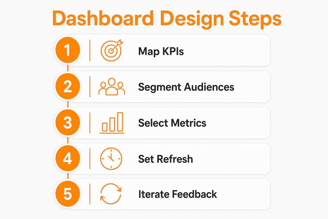
Role-based segmentation is the solution. Build separate dashboard views for each audience type, each with its own KPI set, refresh cadence, and level of detail.
| Dashboard type | Primary audience | Core KPIs | Refresh cadence |
|---|---|---|---|
| Executive summary | CMO, VP Marketing | Pipeline sourced, CAC, revenue contribution, ROAS | Weekly |
| Campaign manager | Campaign and demand gen teams | CPL, MQL volume, conversion rates, budget pacing | Daily |
| Channel specialist | PPC, SEO, content managers | Channel-specific CTR, cost per conversion, keyword rankings | Daily |
| Agency client report | External stakeholders | Campaign performance, spend efficiency, goal progress | Weekly or monthly |
Executives need weekly refreshes for strategic decisions, while channel specialists need daily data to adjust bids, copy, and targeting. Forcing a CMO to scroll through 30 granular metrics wastes their time. Giving a PPC manager only high-level revenue numbers leaves them without the detail they need to act.
The most effective executive dashboards follow a layered structure. The top level shows three to five outcome metrics with clear targets and trend indicators. Clicking into any metric opens a drill-down view with channel-level or campaign-level detail. This approach gives leadership the summary they need while preserving the operational depth that specialists require.
Key principles for audience-specific design:
- Match metric count to cognitive load. Executives see 5–7 metrics. Specialists see up to 12.
- Use color coding to signal performance against target, not just raw numbers.
- Label every metric with its business question. “Pipeline sourced” should display as “How much pipeline did marketing generate this quarter?”
- Build layered dashboard views so executives get summaries and specialists get drill-downs from the same data source.
What tools and automation strategies power modern dashboards?
The technical setup for a marketing analytics dashboard is faster than most teams expect. Connecting platforms like Google Analytics 4, Google Ads, and Meta Ads takes under five minutes with modern connector tools. The hard part is not the connection. The hard part is deciding which metrics matter before you build anything.
Automation reduces manual reporting but requires upfront strategic KPI definition and metric mapping. Teams that skip the strategy phase end up with automated dashboards full of the wrong data, refreshed in real time. That is worse than a manual spreadsheet because it creates false confidence.
Common data sources for a complete marketing dashboard include:
- CRM platforms (Salesforce, HubSpot) for pipeline, CAC, and lead-to-close rates
- Google Analytics 4 for web traffic, conversion events, and audience behavior
- Google Ads and Meta Ads for paid channel performance, ROAS, and cost per conversion
- Email platforms (Mailchimp, Klaviyo) for open rates, CTR, and list health
- SEO tools for keyword rankings, organic traffic trends, and backlink data
AI-powered dashboard features now include anomaly detection, which flags when a metric moves outside its normal range without requiring manual review. This is particularly useful for campaign reporting dashboards that span multiple paid channels simultaneously. A sudden spike in CPL or a drop in conversion rate triggers an alert before the budget damage compounds.
A solid marketing automation checklist helps teams sequence the technical setup correctly. Map your KPIs first, then connect your data sources, then build the visual layer. Reversing that order is the most common and most costly mistake in dashboard projects.
Pro Tip: Schedule dashboard refreshes to match the decision cycle of each audience. Executive dashboards refresh weekly on Monday morning. Channel dashboards refresh daily at 6:00 AM so specialists have current data at the start of their workday.
For teams exploring AI-driven marketing tools, the integration layer is where the biggest efficiency gains appear. Automated data pulls eliminate hours of manual export and paste work every week.
How to maintain dashboards as your marketing goals evolve
A dashboard built in january becomes irrelevant by april if no one reviews it. Dashboards require quarterly reviews to stay aligned with shifting business objectives. Set-and-forget is the fastest path to a dashboard that everyone ignores.
The quarterly review process should follow these steps:
- Audit current KPIs. Ask whether each metric still maps to an active business question. Remove any that do not.
- Check usage data. Most BI platforms track which dashboard views get opened and how often. Low-traffic views signal irrelevance.
- Gather stakeholder feedback. Ask each audience group what questions the dashboard fails to answer. Those gaps become your next iteration priorities.
- Add new metrics for new goals. If the business shifted focus to a new channel or segment this quarter, the dashboard must reflect that.
- Retest the metric count. After adding new KPIs, confirm the total stays within the 8–12 range. Remove lower-priority metrics to make room.
Over-reporting beyond 12 metrics causes analysis paralysis. Teams stop trusting dashboards that show 30 or more KPIs because they cannot identify what to act on. Discipline in removal is as important as discipline in selection.
Iterative dashboard improvement based on stakeholder feedback preserves user adoption over time. The teams that get the most value from their dashboards treat them like products, with regular release cycles and user input driving each update.
Key Takeaways
Effective marketing reporting dashboards connect every metric to a specific business question about pipeline, revenue, or efficiency, and they require ongoing iteration to stay useful.
| Point | Details |
|---|---|
| Limit KPIs to 8–12 per view | More metrics create noise; the brain processes 5–9 data points effectively. |
| Segment dashboards by audience | Executives need weekly outcome summaries; specialists need daily channel detail. |
| Add context to every metric | Targets, prior period comparisons, and benchmarks make raw numbers meaningful. |
| Map strategy before building | Define which KPIs matter before connecting data sources or building visuals. |
| Review dashboards quarterly | Remove irrelevant metrics and add new ones aligned to current business goals. |
What I’ve learned from building dashboards that actually get used
The most common mistake I see is teams building dashboards to impress rather than to decide. They add every metric available because more data feels more thorough. The result is a wall of numbers that no one opens after the first week.
The discipline I keep coming back to is this: every KPI must answer a question someone in the room is actually asking. If you cannot name the person and the question, the metric does not belong on the screen. That filter alone cuts most dashboards from 40 metrics to 10, and the 10 that remain get used every single day.
Audience segmentation is the second thing most teams underinvest in. I have watched CMOs tune out of dashboard reviews because the screen was built for a channel manager. And I have watched channel managers make bad decisions because they only had access to the executive summary view. Building separate views for each audience is not extra work. It is the work.
Automation is genuinely powerful, but only after the strategy is locked. Teams that automate before they define their KPIs end up with fast, accurate, and completely wrong dashboards. Get the metric map right first. Then connect the pipes.
Finally, treat your dashboard like a living document. The marketing performance metrics that matter in Q1 may not be the right ones in Q3. Build in a quarterly review, involve your stakeholders, and be willing to delete metrics that no longer serve a purpose. The best dashboard is not the one with the most data. It is the one that gets opened every morning and drives a real decision by noon.
— Derek
Theartistevolution builds dashboards that connect to your bottom line
Theartistevolution has spent over 18 years helping brands across retail, healthcare, legal, and entertainment turn marketing data into decisions that move revenue. The agency builds and manages full campaign strategies with integrated reporting built in from day one, not added as an afterthought.

Every engagement starts with a marketing assessment that maps your current KPIs to your actual business goals. From there, Theartistevolution configures the right marketing tools and dashboard views for each audience in your organization. The result is a reporting setup your team actually uses, backed by case studies that show measurable pipeline and revenue impact. If your current dashboards are not driving decisions, that is the problem Theartistevolution solves.
FAQ
What is a marketing reporting dashboard?
A marketing reporting dashboard is a visual interface that consolidates key marketing KPIs into a single view, connecting marketing activity to revenue, pipeline, and efficiency outcomes. Effective dashboards track 8–12 metrics and include targets and benchmarks alongside raw data.
How many KPIs should a marketing dashboard include?
A marketing dashboard should display 8–12 KPIs per view. The human brain processes 5–9 data points effectively, and dashboards with more than 12 metrics reduce clarity and increase the risk of analysis paralysis.
What is the difference between an executive dashboard and a channel dashboard?
An executive dashboard shows 5–7 outcome metrics like pipeline sourced, CAC, and revenue contribution, refreshed weekly. A channel dashboard shows up to 12 tactical metrics like CPL, CTR, and cost per conversion, refreshed daily for specialists who need current data to act.
How often should marketing dashboards be updated or reviewed?
Dashboards should be reviewed quarterly to remove irrelevant KPIs and add metrics aligned to current business goals. The data itself should refresh on a cadence matched to the audience: weekly for executives and daily for channel specialists.
What data sources feed into a marketing analytics dashboard?
The most common sources are CRM platforms for pipeline and CAC data, Google Analytics 4 for web behavior, Google Ads and Meta Ads for paid performance, email platforms for engagement metrics, and SEO tools for organic traffic and keyword data.