
Landing page optimization is the ongoing loop of message match, quality assurance, tracking, and prioritized testing. Start by confirming that your headline matches the ad or email that earned the click, then run a pre-launch QA pass before you spend another dollar on traffic. Everything else, including testing and design polish, comes after that foundation holds.
TL;DR:
- Confirm message match and run comprehensive QA before investing in traffic to avoid costly mismatches and tracking failures.
- Prioritize fixing message consistency, exit paths, and mobile speed to significantly increase conversions and reduce bounce rates.
- Structure A/B tests by starting with headlines and CTAs, ensuring sample size and run-time are sufficient to produce reliable results.
- Track full conversion chains, including upstream visits and downstream revenue, to accurately measure true landing page effectiveness.
- Implement ongoing testing and optimization cycles, treating landing page improvements as continuous rather than one-off projects.
Table of Contents
- What Is Landing Page Optimization and Why Does It Drive ROI?
- What Are the Top Benefits of Optimizing Landing Pages?
- What Landing Page Best Practices Should You Fix First?
- How Should You Structure A/B Tests for Landing Pages?
- What Metrics Actually Prove Your Landing Page Is Working?
- How Fast Should Your Landing Page Load on Mobile?
- How Long Should Landing Page Forms Be?
- What Belongs Above the Fold on a Landing Page?
- What Should You Check Before Sending Traffic to a New Page?
- How Has The Artist Evolution Applied These Principles in Real Campaigns?
- Running Landing Page Optimization at Scale: What Actually Works
- How The Artist Evolution Turns This Checklist Into Results
- Where To Go Deeper on Landing Page Optimization
- Sources
What Is Landing Page Optimization and Why Does It Drive ROI?
Landing page optimization is not a one-time redesign. It is a loop: message match, QA, tracking, testing, and lead quality review, then back to message match again as your campaigns shift. Each pass through the loop should tighten the connection between what you promised in the ad and what the visitor experiences on the page.
The financial case is straightforward. When the landing page fails to match the ad’s promise, or the tracking pixel silently stops firing, you are paying full price for clicks that were never going to convert or that convert into leads nobody can trace back to spend. The Leadpages guide to landing page optimization frames this as a sequence for good reason: message match and QA catch the cheapest, most damaging failures before testing even starts.
Optimizing for ROAS means treating the landing page as part of the media plan, not a separate design project. That math is why marketing leaders who treat landing pages as a testing surface, rather than a static asset, tend to see compounding gains quarter over quarter. Small, sequenced fixes accumulate. A headline rewrite this month, a form-field cut next month, a mobile speed fix after that. None of it requires a full redesign.
What Are the Top Benefits of Optimizing Landing Pages?
The payoff from landing page optimization shows up in four places, and marketers who track only conversion rate miss most of it.
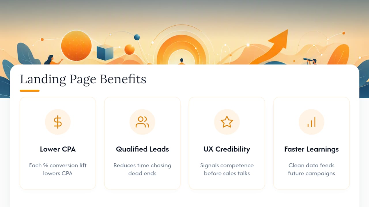
Lower cost per acquisition and higher ROAS. Every percentage point of conversion lift lowers your effective cost per lead without changing your media budget. This is the fastest, most direct ROI story you can tell a finance team.
A higher share of qualified leads. Volume without quality is a vanity metric. Optimizing form fields and page copy to filter for genuine intent means your sales team spends less time chasing dead ends.
Better user experience and brand credibility. A page that loads fast, reads clearly, and asks for exactly what it needs signals competence. Visitors form an opinion of your company before they ever talk to a salesperson.
Faster, more reliable learnings. A tested, well-tracked page produces clean data. That data feeds every future campaign decision, from ad creative to email subject lines, so the value of one optimization cycle extends well past the page itself.
Together, these four outcomes are why landing page testing belongs in the same planning conversation as media buying, not as an afterthought once the campaign is already live.
What Landing Page Best Practices Should You Fix First?
Not every fix carries the same weight. Teams that chase button-color tests before checking message match are optimizing the wrong end of the funnel. Here is the order that actually moves the needle, based on where friction and waste tend to concentrate.
- Confirm message match. The headline, subhead, and offer on the landing page must mirror the ad, email, or search query that drove the click. A mismatch here is the single most expensive failure in paid acquisition, because it wastes 100% of the click’s cost.
- Run full pre-launch QA. Test every form field, confirm the thank-you page loads, and verify tracking before spending a single dollar of media budget on the page.
- Strip navigation and other exit paths. Removing the top navigation bar and footer links has been shown to lift conversions because it removes every reason to leave the page without converting, a point the HubSpot guide to high-ROI landing pages makes directly.
- Front-load your proof. Testimonials, client logos, or a quantified result belong above the fold, not buried under three scroll lengths of copy.
- Shorten the form. Three to four fields is the practical ceiling for most top-of-funnel offers; anything longer needs a strong justification tied to lead qualification.
- Test in this order: headline, then form length, then CTA. This sequence reflects where the largest effect sizes tend to appear, according to the CXL landing page optimization process.
- Design mobile-first and hit your speed targets. More than half your traffic likely arrives on a phone, and a slow mobile experience undoes every other fix on this list.
- Make trust signals and the CTA visually unmissable. Security badges, client counts, and a CTA button that contrasts clearly with the page background all reduce hesitation at the moment of decision.
Pro Tip: Before you touch design, screenshot your ad and your landing page side by side. If a stranger couldn’t tell they came from the same campaign in five seconds, fix that before anything else on this list.
The pattern across this checklist is consistent: fixes that prevent waste (message match, QA) come before fixes that improve the margin (testing, design polish). Skipping ahead to the design work while message match is broken is like polishing the dashboard of a car that won’t start.
How Should You Structure A/B Tests for Landing Pages?
Test order matters as much as test design. Start with the headline, because it carries the most weight in whether a visitor decides to keep reading at all. Move to the call-to-action next, since copy and placement changes there are cheap to build and often produce a fast readable signal. Form length comes third, followed by proof placement, and layout changes last, because layout tests typically need more traffic to reach a reliable result than copy or field changes do.
Every test needs a real hypothesis, not a guess dressed up as one.
Statistical guardrails matter more than most marketing teams treat them. Before you launch, set two things and do not touch them until the test finishes: the sample size required to detect a meaningful difference, and the minimum run time, generally at least one full business cycle to account for day-of-week variation. Checking results early and stopping the moment you see a lead, a practice commonly called “peeking,” inflates your false-positive rate and is one of the most common ways teams talk themselves into a losing variant. The PulseCRO guide to landing page A/B testing puts a number on this risk directly.
Interim stopping based on early positive results can push the false-positive rate to roughly 22%, according to PulseCRO’s analysis of landing page testing, nearly one in four “wins” that would not hold up under a properly run test.
Before you declare a winner, segment the results by device and traffic source. A variant that wins overall but loses on mobile, where most of your volume lives, is not actually a winner. Common mistakes that quietly invalidate results include:
- Running two tests on overlapping traffic without accounting for interaction effects
- Changing the test mid-flight after a “small tweak” that seems harmless
- Declaring a winner before reaching the pre-set sample size
- Ignoring seasonality, like testing a B2B offer only during a holiday week
What Metrics Actually Prove Your Landing Page Is Working?
Submission rate is the metric everyone watches, and it is the least important one on its own. A page can post a great submission rate while feeding your sales team leads that never close. The metrics that actually matter form a chain: visits, submission rate, qualified leads, sales-accepted leads, and revenue per lead. Optimizing for the first number in that chain while ignoring the last one is how teams end up “improving” a page into worse business outcomes.
Tracking has to preserve that chain end to end, which means a few non-negotiables:
- Use consistent UTM parameters across every ad, email, and social post that points to the landing page
- Fire conversion events at the moment of form submission, not just at the thank-you page load, since not every visitor waits for the redirect
- Map UTM and form data into your CRM so a closed deal can be traced back to the exact campaign and page variant that generated it
- Build a dashboard for landing page and campaign metrics that shows submission rate alongside downstream lead quality, not in a separate report nobody checks
To validate lead quality rather than just volume, compare the sales-accepted rate across your top three traffic sources. If one source produces twice the leads but half the accepted rate, you are not looking at a landing page problem. You are looking at a targeting problem the landing page is masking. Teams that measure marketing ROI properly build this comparison into every campaign review, not just quarterly ones.
How Fast Should Your Landing Page Load on Mobile?
Aim for visible content to paint in under roughly 1.5 to 2 seconds on mobile, and treat anything past 3 seconds as a conversion emergency, not a nice-to-have fix. Mobile traffic makes up the majority of clicks for most paid campaigns, and every additional second of load time gives an impatient visitor one more reason to bounce before the page even finishes rendering.
The fixes that move load time the most are rarely glamorous:
- Compress and resize every hero image before upload; a 4MB photo doesn’t need to be that large on a phone screen
- Remove unused scripts and third-party tags that were added for a campaign that ended months ago
- Defer noncritical JavaScript so the visible content renders before chat widgets and tracking scripts load
- Serve assets through a content delivery network to cut latency for visitors far from your server
- Inline critical CSS so the above-the-fold content doesn’t wait on a full stylesheet download
A deeper look at how page speed affects both SEO and conversions shows why this is not purely a technical concern. Google’s ranking signals and a visitor’s patience respond to the same underlying problem.
QA has to match real conditions, not your office Wi-Fi. Test on an actual phone over a throttled 4G connection, not just a desktop browser resized to look like mobile. The HubSpot landing page guide makes the case that many mobile failures, slow-loading forms, buttons that require a second tap, images that never finish rendering, only surface under those realistic constraints.

Pro Tip: Open your own landing page on your phone with Wi-Fi turned off, standing somewhere with weak signal. If it frustrates you in thirty seconds, it’s costing you conversions you’ll never see in the analytics.
How Long Should Landing Page Forms Be?
Three to four fields is the practical sweet spot for most top-of-funnel offers, and the data backing this is not subtle. Forms with three fields convert at roughly 10.1%, compared to 3.6% for nine-field forms, and cutting a form from eleven fields down to four can produce completion increases near 120%, according to LanderLab’s landing page best practices guide. Every field beyond the essentials is a small tax on your conversion rate, charged at the moment a visitor is least willing to pay it.
That does not mean you abandon qualification. It means you move qualification later in the funnel, through a follow-up call, a nurture sequence, or a second-stage form the lead only sees after they have already committed once.
CTA copy performs better when it speaks in the visitor’s voice and states the benefit plainly. “Get My Free Assessment” tends to outperform “Submit” for the simple reason that one describes an action with no payoff and the other describes what the visitor actually gets. First-person, benefit-first phrasing removes a small but real hesitation at the exact moment of decision.
A few more form-level details worth locking down:
- Label every field in plain language (“Work Email,” not “Email Address*”), since ambiguous labels increase both errors and abandonment
- Keep labels visible above or beside the field rather than relying on placeholder text that disappears once someone starts typing, which matters for both usability and accessibility
- Use multi-step forms with conditional logic when you genuinely need more information; research on landing page design patterns shows multi-step forms often preserve completion rates better than a single long form while still allowing progressive qualification
- Reserve required fields for what your sales team truly cannot work without, and mark everything else optional
What Belongs Above the Fold on a Landing Page?
The hero section carries more weight than every other part of the page combined, because a meaningful share of visitors never scroll past it. Four elements need to be there without exception: a headline that states the offer plainly, a one-line value proposition that answers “why should I care,” a primary call-to-action button, and a supporting visual that reinforces rather than distracts from the message.
Social proof belongs in that same fold whenever possible, and the format you choose should match the offer’s stakes. A logo wall of recognizable client names works well for building instant credibility on a B2B offer. A named testimonial with a specific result carries more weight for a higher-consideration purchase, where the visitor wants to see themselves in someone else’s outcome. Quantified results, a percentage lift, a dollar figure, a time saved, tend to outperform generic praise because they give the visitor something concrete to evaluate.
Imagery helps when it shows the real product, the real team, or a real customer in context. It hurts when it’s generic stock photography that could belong to any company in any industry, since visitors have gotten good at recognizing and mentally discounting that kind of image. A few placement rules worth following:
- Put the primary CTA in the first screen a visitor sees, with no scrolling required
- Place at least one proof element, a logo, a stat, or a testimonial snippet, in that same first screen
- Avoid carousels or sliders in the hero; they split attention and most visitors never see anything past the first slide
- Choose one supporting visual that clarifies the offer rather than three that compete with each other for attention
What Should You Check Before Sending Traffic to a New Page?
Every dollar spent on a broken landing page is a dollar you cannot get back, which makes pre-launch QA the cheapest insurance in your entire campaign budget. Run through this sequence before the first click hits the page:
- Submit the form yourself, multiple times, and confirm the thank-you page loads correctly and triggers any downstream automation, such as an email sequence or CRM record creation.
- Verify every tracking pixel fires correctly, and confirm UTM parameters persist all the way through to the CRM record, not just the analytics dashboard.
- Test the page on at least three device and browser combinations, including one older Android device, since that combination surfaces the most rendering issues.
- Run an analytics sanity check by generating a handful of test conversions and confirming they appear correctly segmented by source.
- Confirm lead routing sends the submission to the right sales rep or queue, especially if the campaign targets a specific region or product line.
This sequence matters because pre-launch QA errors cost far less to fix than wasted ad spend does once the campaign is already live. A broken tracking tag discovered on day one of a launch is an afternoon’s work. The same tag discovered on day fourteen, after two weeks of untracked spend, is a budget conversation nobody wants to have.
How Has The Artist Evolution Applied These Principles in Real Campaigns?
Theartistevolution has put this exact priority order to work across client campaigns in retail, healthcare, and professional services, and the results trace directly back to the checklist above.
- A LinkedIn lead generation campaign for an expanding agency client succeeded largely because the landing page message matched the specific value proposition used in each ad variant, rather than routing every click to one generic page.
- A CPG and retail client’s LinkedIn lead generation program used shorter, targeted forms to qualify leads at the point of capture instead of relying on sales teams to filter volume after the fact.
- Ongoing campaign management engagements built in regular testing cycles rather than a single launch-and-forget landing page, which is the same loop structure this article opened with.
Each of these interventions maps back to a specific rung on the priority checklist: message match before testing, qualification built into form design rather than bolted on afterward, and a testing cadence treated as ongoing infrastructure rather than a one-time project. That pattern, fix the expensive problems first and treat optimization as continuous, shows up across every industry Theartistevolution has worked in, not just one vertical.
Running Landing Page Optimization at Scale: What Actually Works
The biggest mistake I see marketing teams make isn’t a bad headline or a weak CTA. It’s skipping QA because the launch date already slipped twice and nobody wants to be the reason it slips a third time. That decision quietly burns more ad budget than any design flaw ever will, and it happens on a rolling basis, campaign after campaign, without anyone connecting the dots back to a missing pixel or a broken thank-you page.
The second mistake is testing without hypothesis discipline. Teams run a test, see a lift, and ship the winner without asking whether the sample size was ever large enough to trust the result. That’s not optimization. That’s guessing with extra steps.
A cadence that works in practice: review core metrics weekly, so problems surface in days rather than months, and run one properly powered test per month per page. That pace respects the sample-size and run-time discipline good testing requires, while still producing steady, compounding gains. Agencies managing this work on a client’s behalf have an added responsibility: protect lead quality even when a client’s stakeholder is celebrating a submission-rate bump that sales hasn’t validated yet.
— Derek
How The Artist Evolution Turns This Checklist Into Results
Theartistevolution runs this exact priority order, message match, QA, tracking, then testing, as a built-in part of every campaign engagement, instead of treating it as a one-time favor before launch.

Most marketing teams know the checklist. Few have the time to run message-match audits, QA sweeps, and monthly test cycles on top of everything else on their plate, which is exactly where a managed engagement earns its cost back in reclaimed ad spend. A marketing assessment starts by identifying where your current landing pages leak budget, whether that’s a message mismatch, a bloated form, or tracking gaps that are quietly hiding your real cost per lead. From there, campaign strategy and ongoing management builds the testing cadence and lead-quality tracking directly into your monthly reporting, so optimization keeps happening after the initial fix, not just during launch week. If the message on your landing page doesn’t match what your ads are promising, brand story development work can close that gap at the messaging level before a single test is even run. Request a marketing assessment to see exactly where your current pages are losing qualified leads.
Where To Go Deeper on Landing Page Optimization
- The Leadpages guide to landing page optimization walks through the full message-match-to-testing loop in more detail.
- LanderLab’s landing page best practices guide covers form-length data and multi-step form patterns.
- PulseCRO’s guide to landing page A/B testing breaks down sample size planning and the risks of peeking at results early.
- HubSpot’s landing page guide offers data-backed tips on navigation removal and social proof placement.
- CXL’s landing page optimization process lays out the impact-based testing order referenced throughout this article.
- For teams building out post-conversion workflows, Baby Love Growth’s guide to lead nurturing covers how to keep leads warm after the landing page does its job.
Sources
- The Complete Guide to Landing Page Optimization | Leadpages Blog
- Landing Page Best Practices: The Complete 2026 Guide
- Landing Page A/B Testing in 2026: What to Test, in What Order | PulseCRO
- How to create a landing page with high ROI + expert and data-backed tips | HubSpot
- Landing Page Optimization Process for High Conversion Rates – CXL